
Hey folks,
Sometimes, as an artist, you just know. Right? You just know if something is the way you want it to be and you can just tell that there’s something off.
Even if it’s the slightest pixel.
It’s hard to imagine that I can continue to fall in love with my Terminal, but, the more I spend time tweaking the design, moving pixels a few more off-of-center, the better it feels and the better it operates.
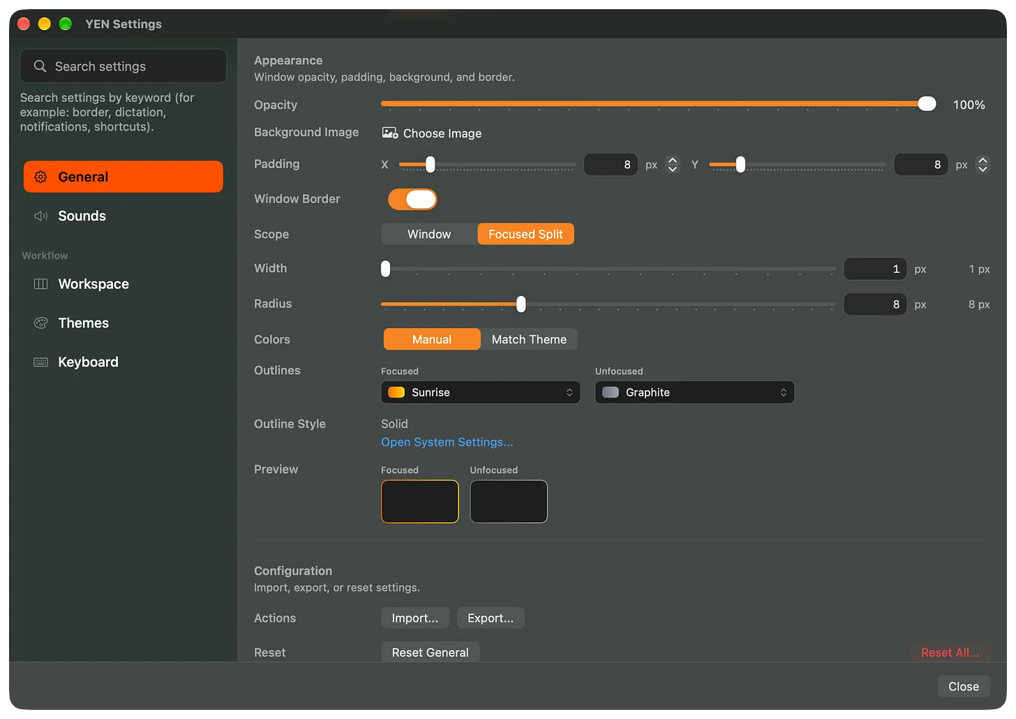
This past week I took a serious loo at the Settings Page and it dawned on me that I hate it, terribly-so. I hate the left-column, tired look and it feels like something out of the mid-90’s in terms of UI / UX.
Enough of that.
So, we’re doing away with this look and coming in with something fresh, something closer to native, and something much more pretty.
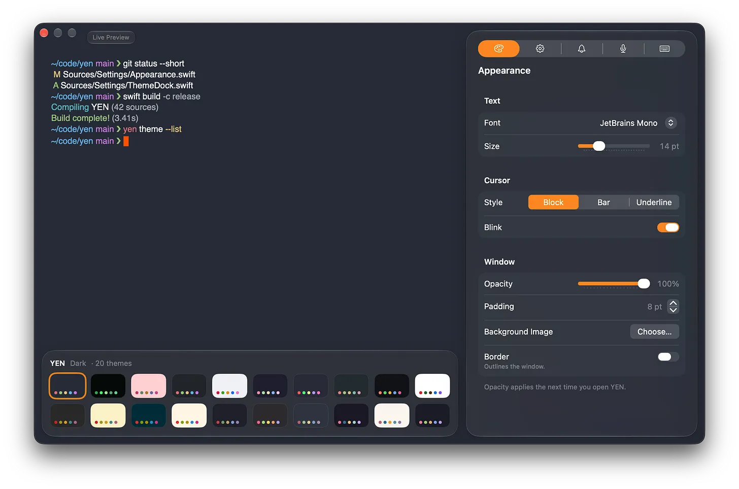
And, I’ve removed a bunch of the cruft like 80+ themes and just focus on the top-hitting, all-time favorites. Might as well.
Now, it’s just there when you need it and gone when you don’t. Side panel on the right and a nice drawer for themes (with more space to preview the results) below. Natively drawn for the latest macOS and painfully translated into something I actually like.
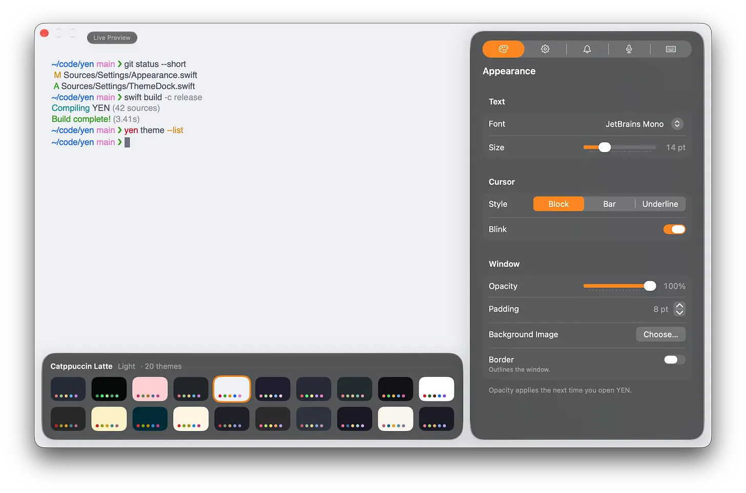
I hope you like it. Fresh off of the bench, version v1.264, and counting.
Talk soon,
8