

Your Terminal’s Settings Got a Quiet Redesign
Moving from toolbar tabs to a sidebar and rebuilding the settings experience end-to-end.

Hey folks!
YEN’s settings window got an overhaul. Not because the old one was broken — it worked fine. But “fine” is not the bar we aim for, and the toolbar tab pattern had started showing its limits.
Here is what changed, why, and how we shipped it without breaking anything for existing users.
The Problem With Toolbar Tabs
macOS settings windows have used toolbar tabs since the System Preferences era. Five icons in a row, click to switch. It works.
Until it doesn’t.
The moment you have more than five or six categories, the toolbar gets crowded. Labels get truncated. The window stretches. You cannot search. You cannot see descriptions. You are clicking icons and reading tiny labels, hoping you guessed the right one.
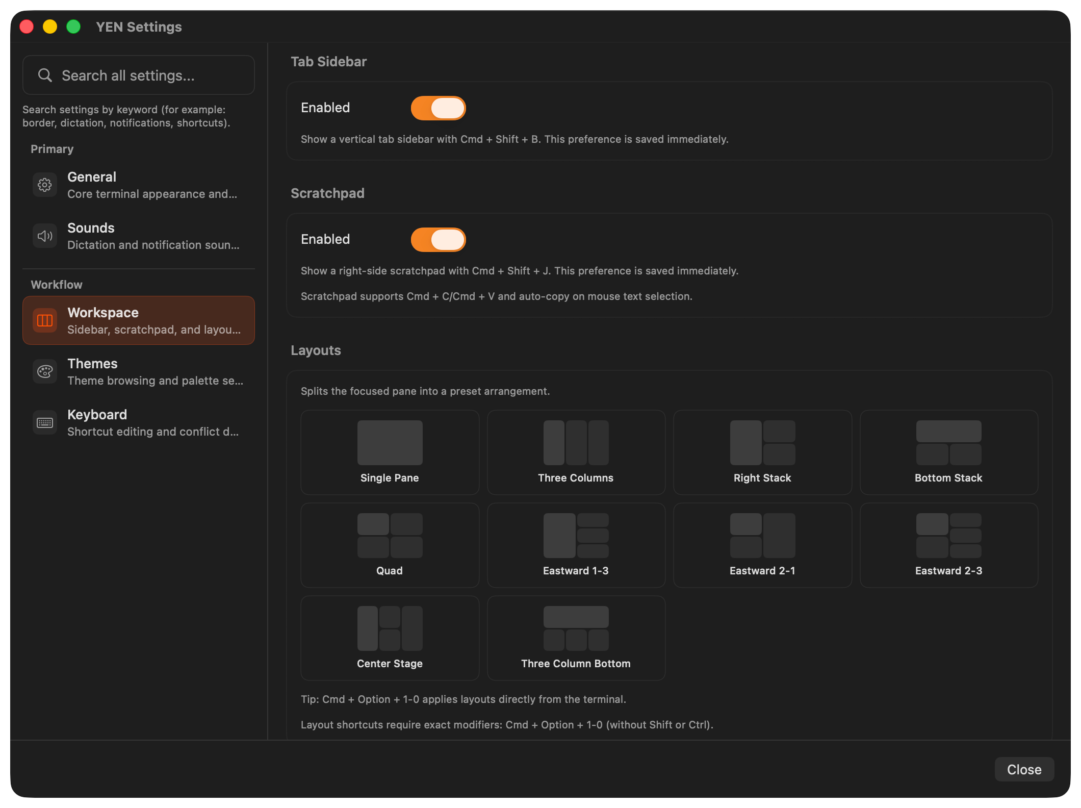
YEN had five settings categories — General, Sounds, Workspace, Themes, Keyboard — and even at five, the toolbar felt like it was working against us. Every category was a single word and a symbol. No context. No grouping. No way to discover what lived where without clicking through each tab.
We looked at how the best macOS apps handle settings today. Raycast. Linear. Arc. The pattern is clear: A left sidebar with icons, titles, descriptions, and grouped sections. It scales. It is searchable. It communicates hierarchy. And it feels native on modern macOS.
So I rebuilt it.
What Changed
There are a bunch of changes but I’ll try to keep this concise since I have a terrible habit of over-sharing:
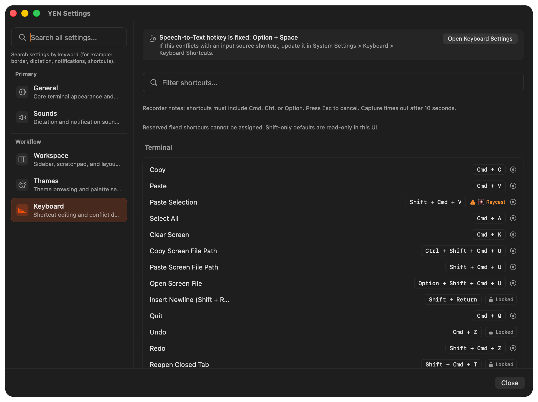
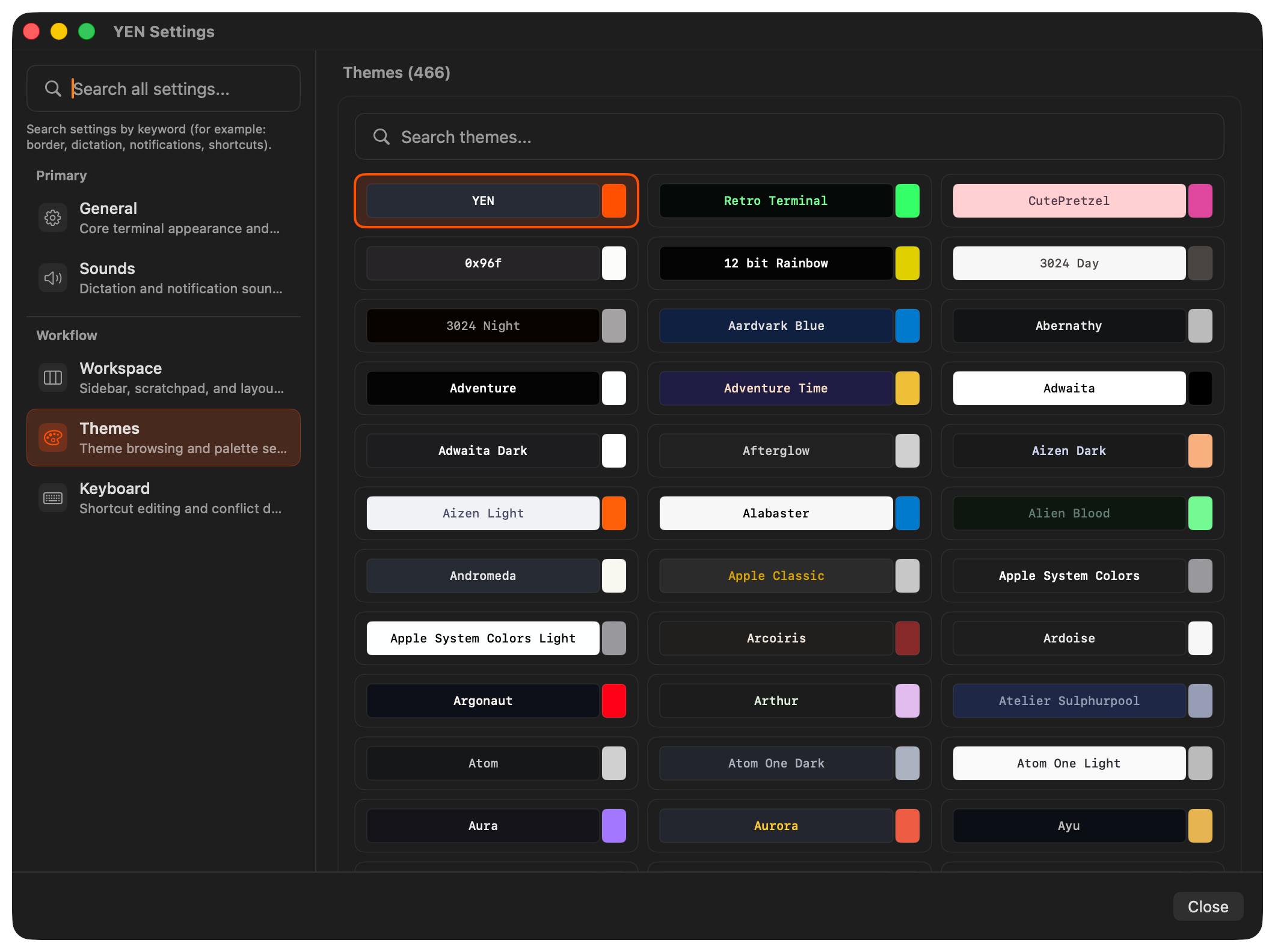
Sidebar Navigation: The toolbar is gone. In its place: a fixed-width left sidebar with two grouped sections — Primary (General, Sounds) and Workflow (Workspace, Themes, Keyboard).
Search Moved to the Sidebar: Global settings search used to live at the top of the detail pane. That meant it was contextually tied to whatever tab you were on, even though it searched across all categories. Now search lives in the sidebar header, above the navigation rows. Type a query and results appear inline. Hit Return to jump to the matching category. Hit Escape to clear. The search field stays in one predictable place regardless of which section you are viewing.
Descriptions That Actually Help: Every sidebar item now has a human-readable description, like “General — Core terminal appearance and behavior.” Simple, I know, but these aren’t just labels. They are search aliases too — type “dictation” and you land on Sounds. Type “scratchpad” and you land on Workspace. Type “palette” and you land on Themes.
Accessibility Built In: The sidebar respects every macOS accessibility setting we could find, like reducing transparency, motion, and differentiating without color. Small things to help folks get around faster like keyboard navigation works end-to-end, no mouse required.
The small things matter, my friends!
Why This Matters
Settings is the second most-opened window in any app, after the main window itself. It is also the window where users form opinions about quality. A settings window that feels organized and discoverable signals that the rest of the app is equally considered.
The toolbar tab pattern served macOS well for twenty years. But apps have gotten more complex, and user expectations have shifted. A sidebar with descriptions, grouping, and integrated search is not a novelty — it is the new baseline.
YEN’s settings window now meets that baseline. And because the rollout is flag-gated, we can iterate on the sidebar without risking the experience for users who prefer the toolbar.
Small surfaces, big signals.
— 8