

Shipping Things That Make Me Happy
Or normalizing the Settings UI / UX to be prettier.

Hey folks!
This work ships in YEN v1.087.
I spent time on something that can sound small from the outside: Normalizing the design in the Settings Panel.
That means labels, sliders, descriptions, shortcut rows, color controls, and the little bits of spacing that most people only notice when they are wrong. It is not the kind of thing that shows up well in a feature checklist. It is also exactly the kind of thing that changes whether an app feels cared for.
But I really think this stuff matters, especially because I use this small device every single day for really serious work.
You see, the Settings (as we all know) is where a user goes when the default product does not quite match how they work. If that surface feels uneven, the message is subtle but real: customization exists, but it is not loved. I want YEN to send the opposite message.
If I give you knobs, those knobs should feel deliberate. Intentional.
Cared for, even.
The Small Things, Always
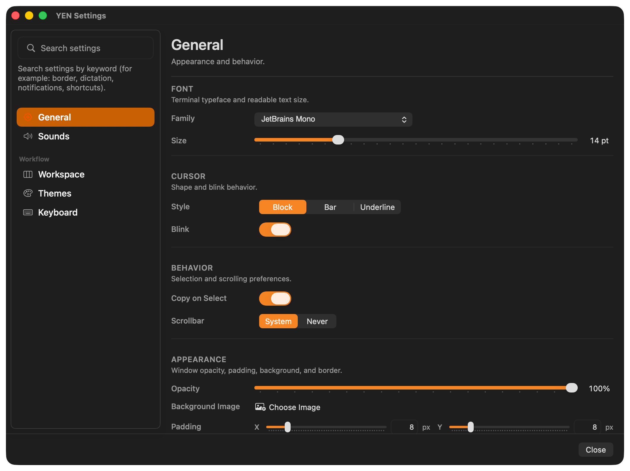
The Settings panel had grown quickly because YEN has a lot more native configuration now.
There are terminal basics like font, cursor, opacity, padding, and background images. There are notification controls. There are workspace controls for the tab sidebar, scratchpad, and browser behavior. There is the theme gallery. There is a full keyboard shortcut editor with conflict detection. There are chromatic window borders with focused and unfocused palettes.
Individually, these features worked. Together, the page was starting to show seams.
Some labels wrapped into two lines while nearby labels stayed on one line. Some sections had helpful little descriptions under the heading, while others jumped straight into controls.
Some sliders had values on the far right, but did not give you a direct way to type a value. Padding sliders had visual marks that made the control look busier than it needed to be. Border width and border radius could both read as 1 px, but their slider positions did not feel like they shared the same baseline.
None of that is catastrophic. But all of it adds up. And it hurts my face when I see things that aren’t where they should be.
Or as pretty.
A settings panel should not make you wonder whether two controls are built from two different design systems. It should feel like one surface.
What I Changed
I normalized the row-label column across the Settings tabs.
That is a simple sentence, but it matters. Labels now get the same amount of room in General, Sounds, Workspace, Themes, and Keyboard. A control like Window Border should not be forced into a cramped two-line label while nearby controls have space. The visual rhythm should stay stable as you move through the app.
I also made section descriptions canonical.
YEN already had a few nice section headers with short explanations, like the Browser section in Workspace. I expanded that pattern across the panel. General now explains what Font, Cursor, Behavior, and Appearance are for. Sounds explains focused notification behavior and Translate-on-Dictate. Themes explains catalog scope and gallery previewing. Keyboard categories explain what kind of shortcuts live in each group.
These descriptions are intentionally short. They are not tutorials. They are orientation. The goal is to make the panel easier to scan without turning every section into documentation.
I brought manual numeric entry back to slider-backed controls.
Sliders are good for feel. Text fields are good for precision. Settings needs both.
Padding X and Y now keep the slider, but also let you type the pixel value directly beside the control. Window Border width and radius now work the same way. The value is no longer just a readout; it is editable.
That sounds minor until you are trying to set two values to exactly the same number. A slider is great when you are exploring. It is annoying when you already know the value you want.
I also fixed the baseline mismatch between Window Border width and radius.
Both can show 1 px, so both should treat 1 px as the same kind of minimum. Before this pass, the radius slider could sit at a different baseline than width even when both read as 1 px. That is the kind of mismatch that makes a panel feel slightly off even if you cannot immediately name why.
I checked the focused and unfocused outline color behavior too.
The Window Border controls let you pick a focused palette and an unfocused palette, or let the border match the active terminal theme. That surface only earns its keep if the colors actually resolve, persist, preview, and change independently. I tightened the review around those code paths and kept the existing contrast and theme-resolution behavior intact.
Oh, and at least for my own work on the design, I also added test coverage for saving multiple custom keyboard shortcut combinations. I don’t want to go backwards, ever.
The Keyboard tab is not just a visual list. It writes real keybind overrides. A shortcut remap has to unbind the old default trigger and bind the new one so both do not stay active in parallel. This pass added coverage for multiple remaps saving together, including combinations that use Option, Shift, Control, and Command.
That is the difference between a settings UI that looks editable and one that can be trusted.
Why This Is Worth Doing
I like building big features. Browser previews, speech-to-text, command palettes, file browsing, chromatic borders, and terminal-first IDE tools are fun because they are obvious. But software quality is often decided by the less obvious work.
Does the value field clear correctly when you start typing a new number? Does a label wrap because the row was designed too narrowly? Does a section tell you what it is for without talking too much? Does a slider show the same value in two places but behave differently under your hand? Does a shortcut editor really save the combination you recorded?
Those are not superficial details to the person using the app every day. They are friction.
And because YEN is a terminal-first IDE, the bar is higher. Developers live in tools for hours. They notice inconsistency. They notice when a native panel feels like a quick wrapper around a config file instead of a real product surface.
My approach is to keep the terminal powerful while making the native UI feel intentional wherever native UI is the better tool.
Settings is one of those places.
What I Want Settings To Communicate
The Settings panel should say: This app is configurable, but not careless.
It should say that visual customization is not an afterthought. It should say that accessibility and focus states matter. It should say that keyboard shortcuts are first-class, not a hidden text-file trick. It should say that if something has a slider, you can still type the value like an adult.
Most of all, it should say that I am willing to improve the boring parts.
There is a lot of quiet, methodical work in YEN. Some of it is deep architecture. Some of it is release safety. Some of it is making sure a label does not wrap awkwardly next to a toggle.
I think all of it counts.
The terminal is the center of the product, but the surrounding surfaces are part of the experience too. If those surfaces feel uneven, the product feels uneven. So I keep going back through them, tightening the details, and making the app feel more like itself.
That is what this Settings pass was about.
Not a redesign for the sake of a screenshot.
A normalization pass so the whole panel feels more coherent, more precise, and more respectful of the person using it.
Obsessing about the product to even the smallest pixel is how you know you really care and is a good sniff test of quality.
That’s the bar. I’m going to keep reaching for it.
And this makes me really, really happy.
— 8